Better measurement for innovation
Innovation Dashboard Survey Report
Learn how large organizations use innovation dashboards to communicate about innovation performance. What metrics are used? Who are the audiences? What software is used?
Innovation dashboards have emerged as an important tool to help address a significant challenge in innovation performance measurement: how best to communicate innovation performance data to different audiences in an organization.
To better understand the current practices related to innovation dashboards, IRI (an industry organization focused on enhancing innovation management practice) conducted a survey of their members and other large organizations. Collectively the respondents represent in excess of $10 billion in annual R&D investment. Our report presents the results of that survey.
What is an innovation dashboard?
An innovation dashboard is a synthesized view of an innovation portfolio’s performance. The reporting format can range from a sophisticated data visualization updated in real time, to a few numbers periodically updated on a team’s whiteboard!
Good innovation dashboards report innovation metrics that enable the audience (often senior business & innovation leaders) to effectively manage their innovation portfolio(s). Those metrics typically capture information about the innovation portfolio’s performance, e.g.:
- outcomes forecast or achieved,
- the current status of projects in the pipeline
- inputs/resources used
- measures of the speed, efficiency or efficacy of the innovation portfolio
The diagram below illustrates the information one survey participant’s organization reports on their innovation dashboard—download the full report for further information.

Who uses innovation dashboards?
Innovation dashboards are widely used by large organizations who invest heavily in R&D or innovation. Nearly 60% of organizations surveyed were using innovation dashboards—and an additional 25% were considering creating a dashboard.
Amongst those organizations, most used their innovation dashboard to communicate with management audiences. And most used their dashboards to communicate with multiple audiences—for example, around 80% serve at least three audiences. Using a single dashboard needs to be approached with caution given the very different needs of, for example, a portfolio manager and a chief innovation officer.

What is reported on an innovation dashboard?
The information about innovation performance that organizations report on innovation dashboards can be segmented into three main categories:
- Project-level information—performance of discrete projects, reported in aggregate.
- Portfolio-level information—projects reported by categories or stages, to gauge coverage, diversification, etc.
- Organization-level information—other measures of the “state of innovation.”
Project-level information on innovation dashboards
Project-level information reported on innovation dashboards typically includes metrics on:
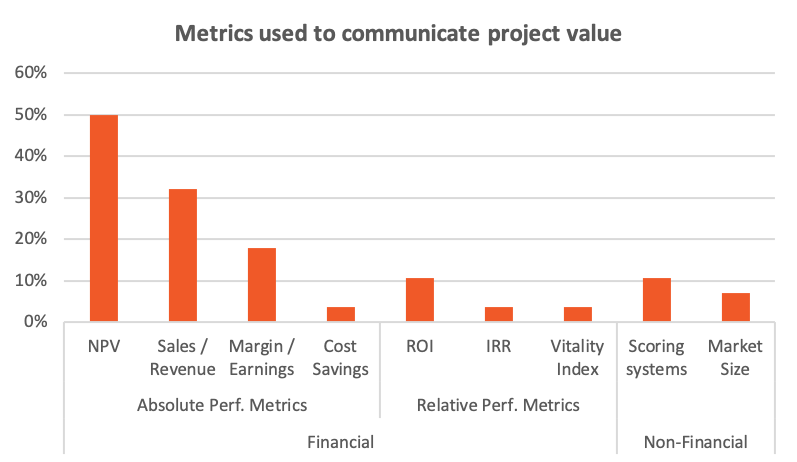
- Potential project value—this leading indicator is typically reported using traditional financial indicators measuring either absolute performance (e.g., forecast revenue) or relative performance (e.g., return on innovation). The graph below shows how frequently different types of metrics are used. Non-financial indicators are occasionally reported, including for non-core or earlier stage initiatives.
- Projects’ risk level—this is assessed by a range of approaches from the simple (qualitative assessment) to the more sophisticated (structured scoring systems, risk-adjusted forecast financial metrics).
- Project success—this lagging indicator is most often assessed in terms of sales, but is frequently assessed in terms of the more general measure of whether a project has achieved its original outcome.
- Most organizations report these metrics both in aggregate as well as for certain categories of project, such as by business unit or stage of development
The graph below illustrates the most commonly used innovation metrics to track potential project value—download the full report to see which metrics are used for the other aspects of innovation project performance.
Project Status
Innovation dashboards are also used to report on the status of in-progress projects. The graph below shows how organizations view the effectiveness of different metrics used for reporting status.
Practitioners prefer to use status metrics that focus on the outcomes or outputs of the project—which are all proxies for learning, the ultimate objective of an innovation project. Metrics that track inputs (e.g. resource utilization) are seen as less effective—but still useful.
Portfolio-level information on innovation dashboards
Innovation dashboards can be a useful tool for monitoring the state of an organization’s innovation portfolio.
The 3 most common categories used to illustrate portfolios align with common management questions:
- Stage of development: does the portfolio have an appropriate distribution of risk?
- Impact: is the portfolio comprised of lots of small bets, or one large bet?
- Length of project: will the portfolio have an impact on an appropriate time scale?
Organization-level information on innovation dashboards
To communicate information about the “state of innovation” at an organizational level, organizations use a mixture of innovation metrics across the following categories:
- Inputs – measures of tangible quantities put into an innovation process to enable success (e.g., budget).
- Outputs – measures of what an innovation process has produced, including both “finished” innovations (e.g., ready to go to market) and interim outputs (e.g., proof of concept prototype).
- Outcomes – measures of results stemming from use of the outputs of an innovation.
- Relative performance metrics – compare performance of innovation projects, over time as well as across organizations (internally or externally).
Reporting innovation metrics across each of these four categories will provide a complete picture of an organization’s innovation performance (see here for further details). While a majority of organizations report metrics for 2 of these categories, none are reporting metrics across all four categories.
How are dashboards managed?
Findings from the survey identify common aspects of how innovation dashboards are set up and managed:
- Dashboards are typically developed internally, rather than using off-the-shelf solutions.
- Most organizations update and share their dashboards on a set periodic schedule (e.g., monthly).
- Responsibility for updating is typically shared between manager, project manager, and director-level staff.
- When organizations use dashboards to communicate with multiple audiences, practices are split: half use a one-size-fits-all approach & half use multiple dashboards, tailoring content to specific audiences.
- Depending on the dashboard’s purpose, projects are removed from the dashboard once completed or retained for around 3 years.
- Few organizations conduct formal, periodic reviews of their dashboard’s effectiveness.
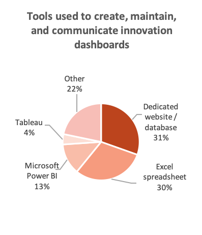
Most firms use simple tools like Excel or a dedicated database & website to create their dashboards. More specialized data visualization software is used by some, including Microsoft’s Power BI, Tableau and Qlikview.
1
Identify your audience
Who are your “customers”? e.g. Director of R&D, VP of business unit, etc.
2
Understand their information needs
What decisions do they need to make and what information does that require?
3
Choose what information to share
What information is it feasible, efficient and effective to share via a Dashboard ?
4
Build an MVP
Test a minimum viable product with a sample of your audience and refine based feedback.
5
Select software
Note: “Select software” is Step 5, not Step 1—don’t be tempted to start with software as it won’t answer the question of what you should measure.
6
Implement and launch
Launch!
7
Review
Conduct quick, periodic reviews (e.g., once a year) to make sure the dashboard is doing its job.
1. Identify your audience
Who are your “customers”? e.g. Director of R&D, VP of business unit, etc.
2. Understand their information needs
What decisions do they need to make and what information does that require?
3. Choose what information to share
What information is it feasible, efficient and effective to share via a Dashboard ?
4. Build an MVP
Test a minimum viable product with a sample of your audience and refine based feedback.
5. Select software
Note: “Select software” is Step 5, not Step 1—don’t be tempted to start with software as it won’t answer the question of what you should measure.
6. Implement and launch
Launch!
7. Review
Conduct quick, periodic reviews (e.g., once a year) to make sure the dashboard is doing its job.
Copyright © 2026 · All Rights Reserved · New